Building academic resilience through practice and AI feedback
Background
PhoenixRise is an app that helps university students build
resilience and overcome academic burnout.
The idea grew from my own experience with academic burnout and
seeing friends struggle with it, too. It inspired me to explore
how we could better support students through that challenge.
I developed PhoenixRise independently, from research through
design and testing prototypes with students to building the app
in React Native with AI feedback.
How could we help students overcome academic burnout?
Through research, I saw an opportunity to help students handle
academic challenges. That way, they would feel less overwhelmed
because they know how to tackle them.
Solution
Help students build resilience through reflection and practice.
Research on reducing burnout led me toward cognitive-behavioral
techniques
[1]. These strategies help people practice better ways to overcome
difficult situations.
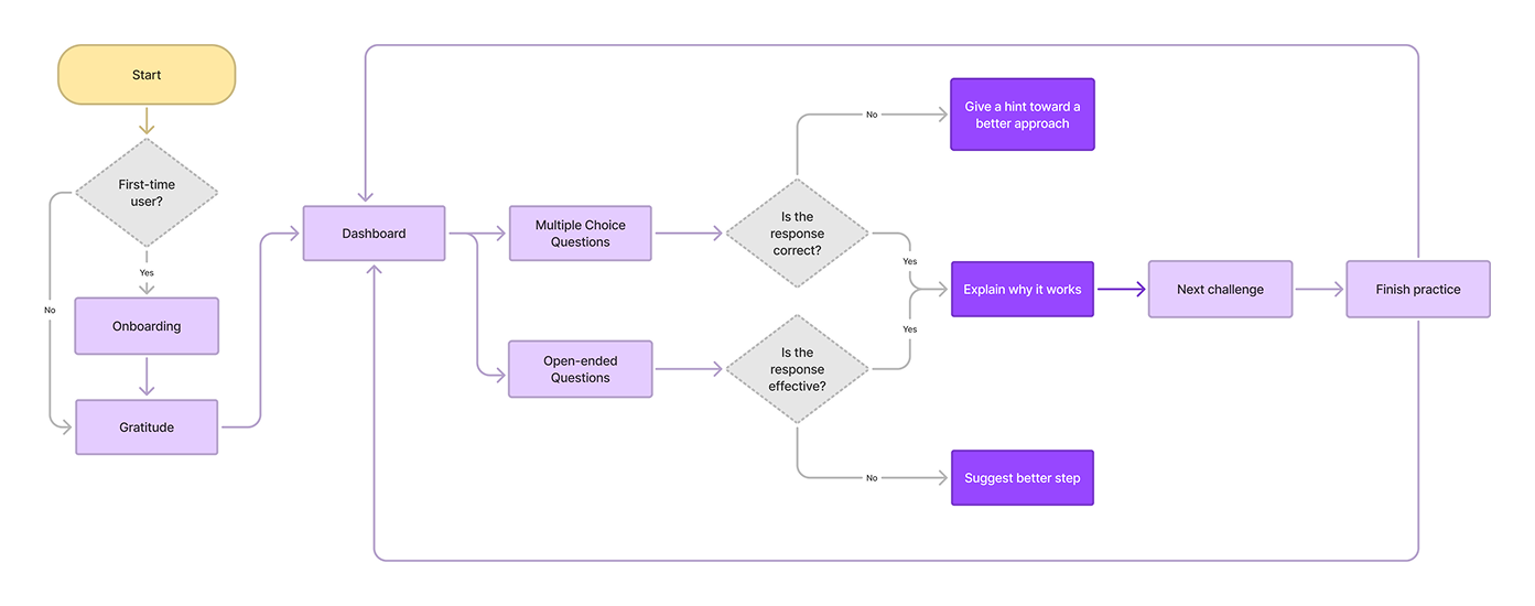
I turned this research into 3 features. Students reflect on
positive moments, practice different scenarios, then apply what
they learned.
Build positive mindset
Reflect on what they’re grateful for to focus on the good in
their lives.
I wanted to understand how other students experienced academic
burnout.
I explored discussions on Reddit to learn how it affected their
studies.
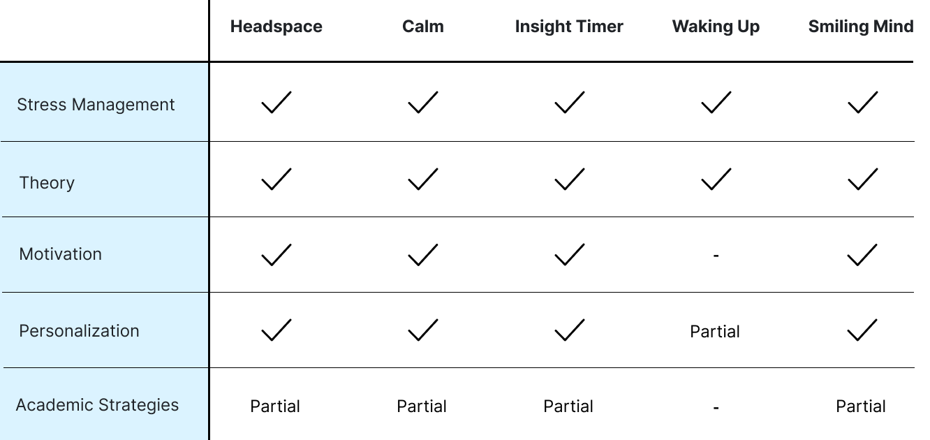
Competitor Analysis
Exploring the Solutions
I wanted to understand how to help students manage academic
burnout.
I explored academic articles on reducing academic burnout and
making practice more engaging.
Design Goals
Based on the research, I set two goals to help students handle
academic challenges.
Learn better ways to respond
Research showed how coping strategies could help reduce
academic burnout
[2]. I aimed to provide resources to help students handle
academic challenges.
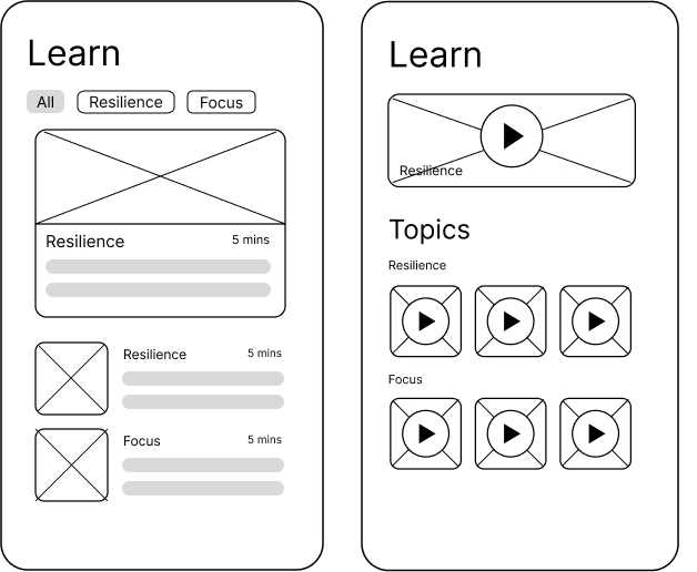
To achieve this, I explored articles and videos so students
could choose how to learn these strategies.
Apply what they learn
Research also showed that learning from resources alone
might not be enough
[3]. I aimed to help students practice strategies for academic
challenges.
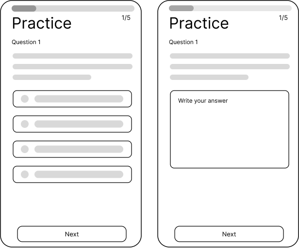
I explored multiple-choice and open-ended questions to give
students different ways to practice.
User Feedback
Students tested my lo-fi wireframes, and I discovered two ways to
improve Practice.
Making academic challenges easier to approach
Students found coursework difficult during burnout and worried
Practice would feel too hard. This showed that they
needed something easier to start with.
Responding to different approaches
I gave students the same academic challenge and asked how they
would handle it. Their different approaches showed me that
feedback needed to be tailored to each answer.
User Flow
Design Rationale
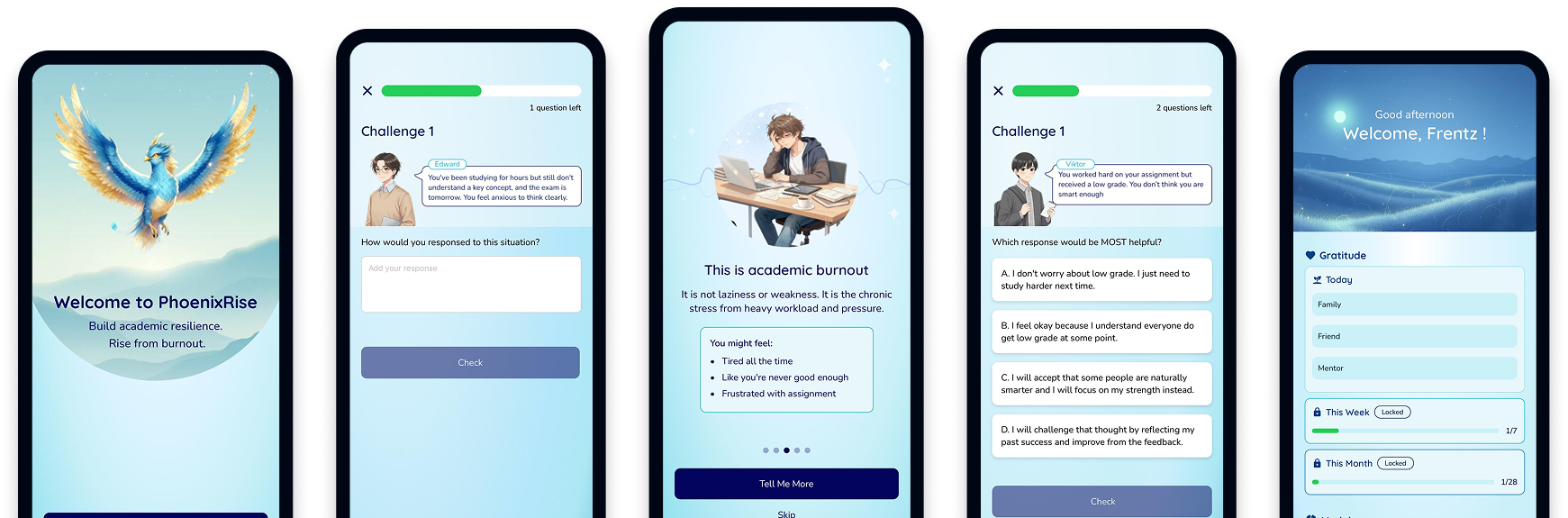
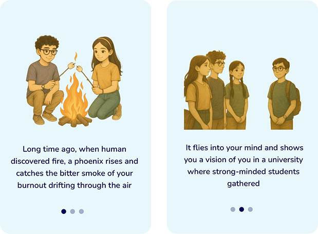
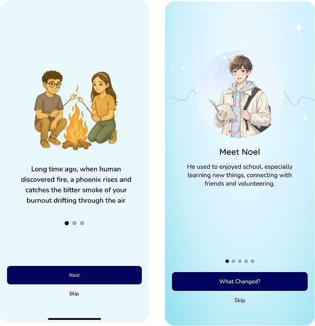
Introducing burnout through storytelling
Adding a story helps increase engagement in an educational
game
[5]. This inspired me to introduce burnout through a story
before explaining the activities.
The story is about a phoenix that rises to help students
overcome burnout. It is introduced as a companion that
guides students through the activities.
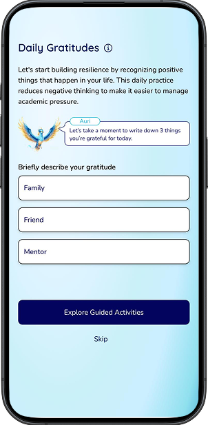
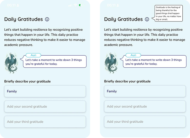
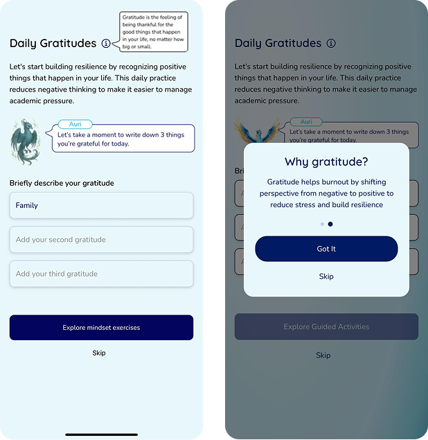
Making gratitude easy to start
Students are more likely to experience negative emotions
during burnout. So, I added gratitude writing as a way to
boost their positive emotions
[4].
I added three short prompts for students to share what
they’re grateful for. If they’re unsure what gratitude
means, they can open the tooltip for an explanation.
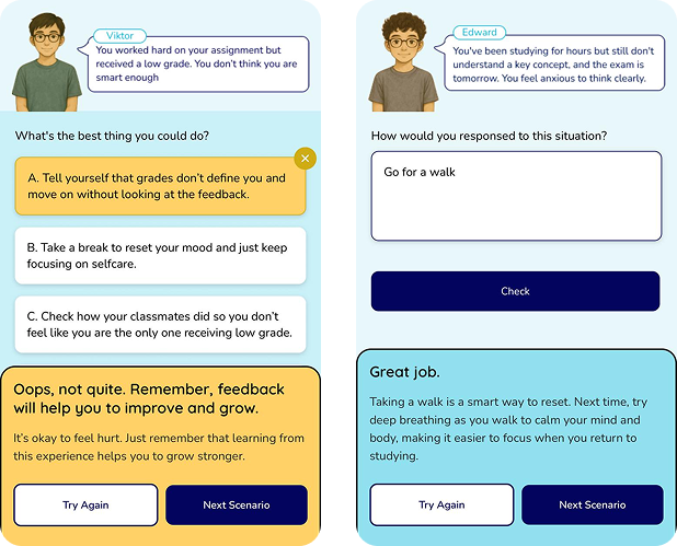
Preparing students to write their responses
Writing answers with feedback helps people remember better
than choosing an answer
[6]. I wanted students to recognize effective strategies and
practice forming their own responses.
I added multiple-choice questions as a warm-up. Students
then write their answers in open-ended questions to get
personalized feedback.
Gamification
Interactive Challenges
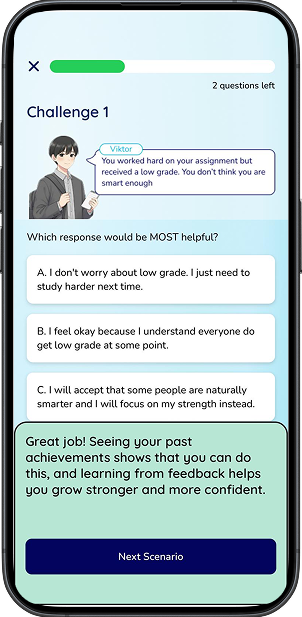
Completing scenarios successfully could help students build
confidence
[3]. I wanted students to start with manageable challenges
before tackling harder ones.
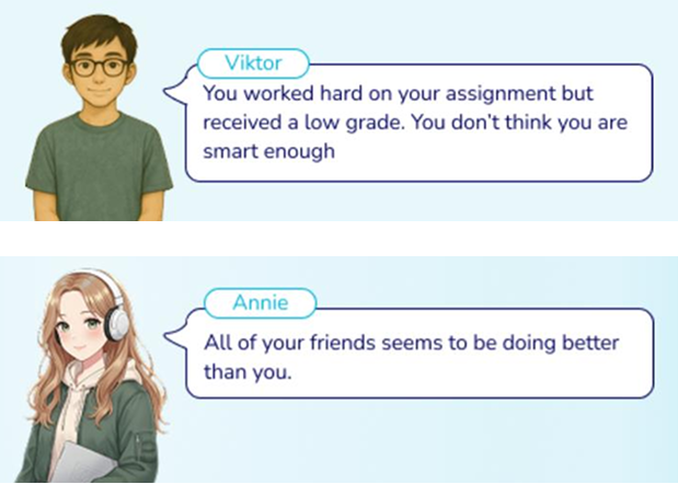
I also designed different academic scenarios so students can
practice various strategies.
Progress & Achievement
Seeing progress can help people reach their goals
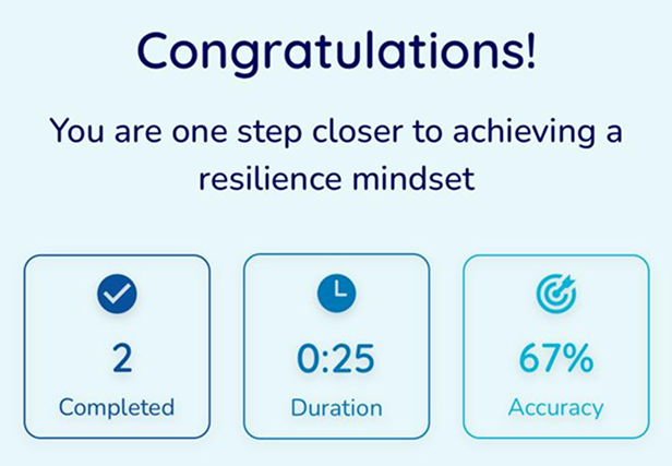
[7]. So I wanted students to see their results after each
practice session.
I paired these results with an encouraging message to
recognize their effort. This aimed to motivate them to keep
practicing, even after a lower score.
AI Development
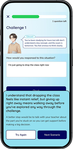
I built AI feedback that responds to how each student answers each
academic challenge.
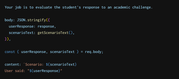
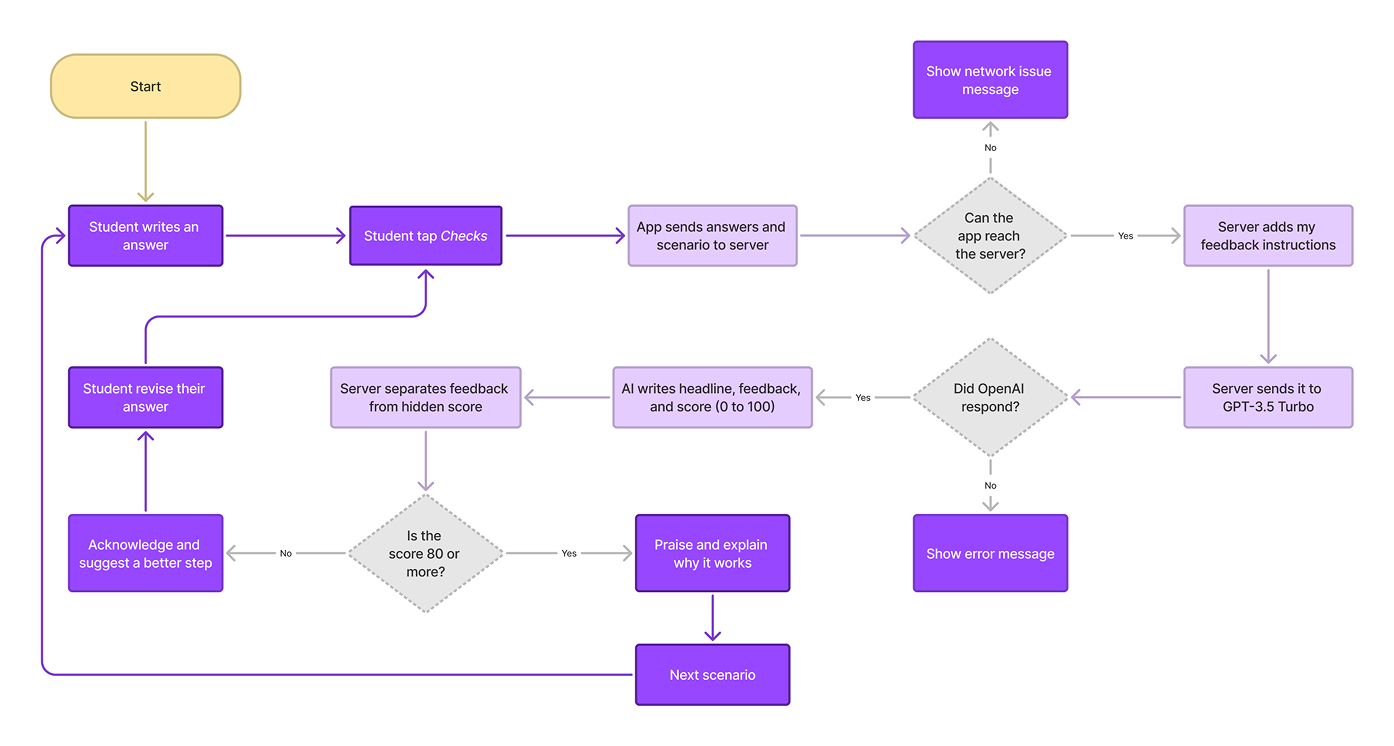
I connected PhoenixRise to OpenAI’s GPT-3.5 Turbo through a
Node.js/Express server I built. The app sends the answer and
scenario to my server. The server then requests feedback from
OpenAI, keeping the API key out of the app. I aim to provide
supportive feedback that explains why a response might or might
not help.
Matching feedback to the challenge
Without knowing the academic challenge, the AI could give
misleading feedback. Therefore, I sent each student’s answer
with its scenario to help the AI give more relevant
feedback.
Setting the AI’s tone
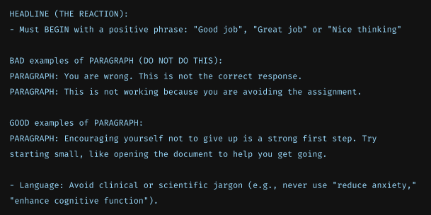
I gave the AI examples of supportive feedback to guide its
tone. I instructed the AI to recognize effort and suggest a
next step using simple language.
Showing feedback based on the answer
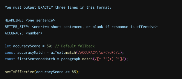
I instructed the AI to provide feedback and a hidden score
for each answer. If they score 85 or higher, it explains why
the answer works. Otherwise, it explains the problem and
suggests a better strategy.
Usability Testing
Participants
5 students
(3 initial, 2
follow-up)
Method
In-person moderated
Duration
30 minutes each
Tasks
Onboarding, Gratitude, and Practice
I tested whether first-time users could understand the app without
my guidance.
I asked participants to explain the app’s purpose, write their
gratitudes, and complete academic challenges. I recruited 3 SFU
students through social media and in a campus study space.
I ran each session in person on my phone without explaining the
app. This helped me see where students got stuck on their own.
After each task, I asked follow-up questions and took notes to
understand their action. I then compared their answers to find
common problems and decide what to improve.
Making burnout relatable
Some students thought the phoenix was burnout. This
distracted them from understanding burnout and how it
affects their studies.
I replaced the fantasy story with a student’s experience
before and during burnout. This gave students a clearer
example of burnout and context for how this app could help.
BeforeAfter
Explaining the purpose
Some students were new to gratitude and took a long time to
decide what to write. Learning what gratitude is and why it
matters on the same screen felt overwhelming.
I split the explanation into two pop-ups explaining what
gratitude is and why it matters. This helped students
understand gratitude faster, so they could start writing
easily.
BeforeAfter
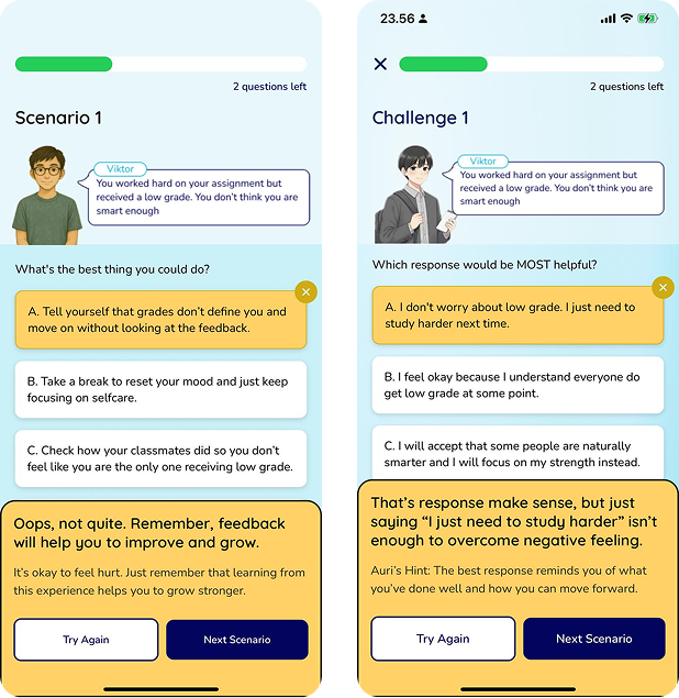
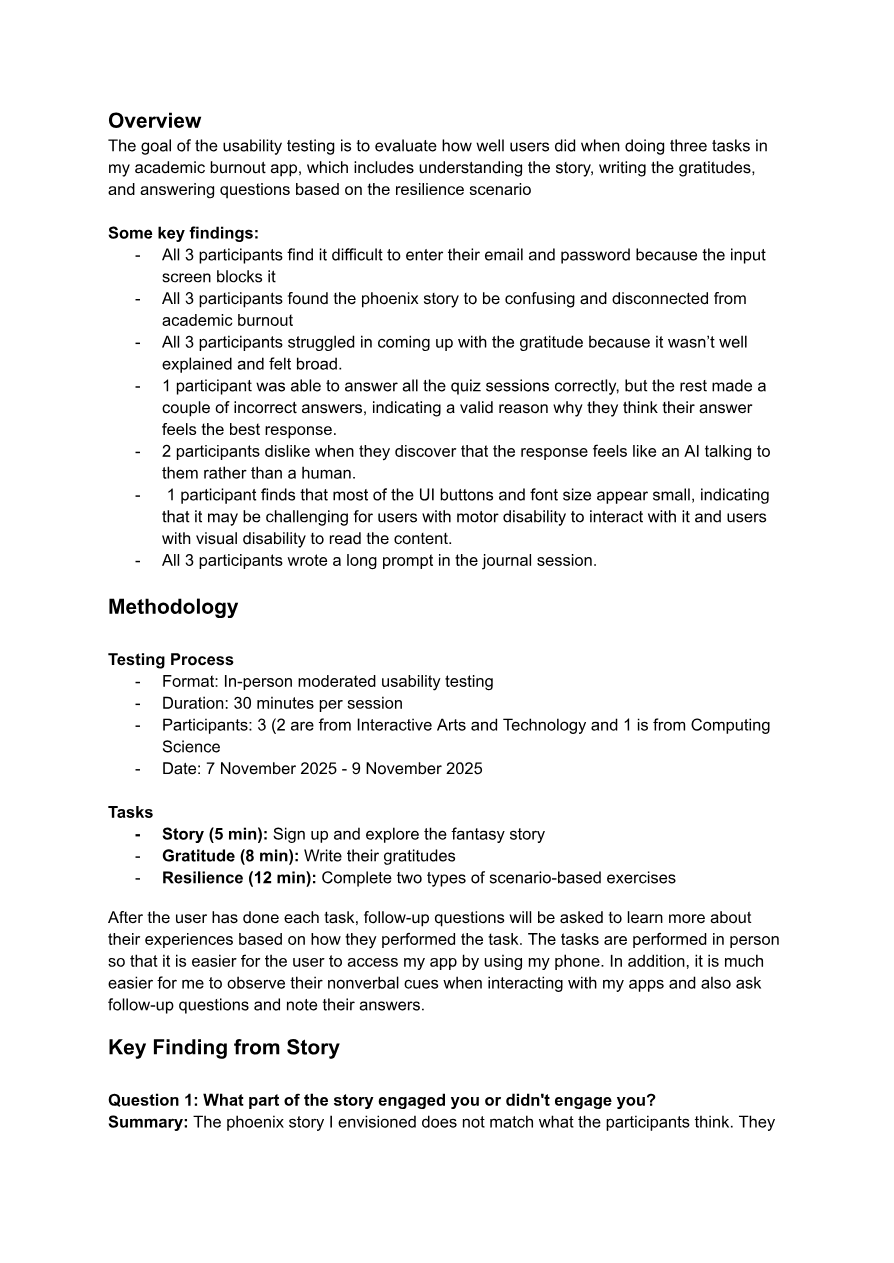
Making feedback more supportive
Students were confused when their answers were marked
incorrect. They explained why it felt helpful to them, even
if they weren’t the best option.
I revised the feedback to acknowledge their reasoning and
suggest a better approach. This helps students understand
why another approach could work better.
BeforeAfter
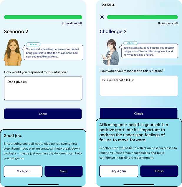
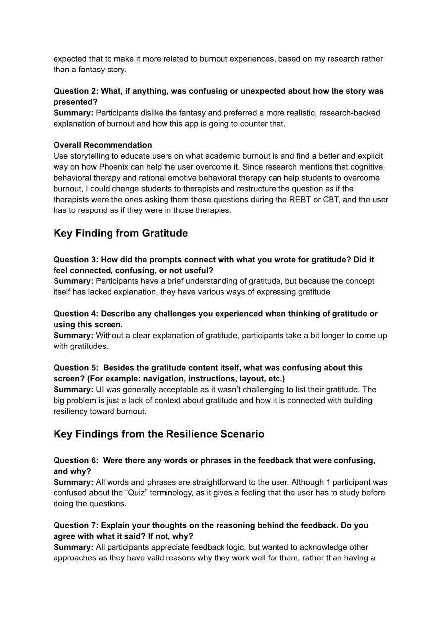
Making feedback clearer
The AI’s headline made students think ineffective answers
were correct. They didn’t realize the problem was explained
in the smaller text.
I revised the headline to acknowledge their reasoning and
explain the problem. This helps students see what to improve
and use the hint to revise their answer.
BeforeAfter
Page 1 of 5.OverviewThe goal of the usability testing is to evaluate how well
users did when doing three tasks inmy academic burnout app, which includes understanding the
story, writing the gratitudes,and answering questions based on the resilience
scenarioSome key findings:- All 3 participants find it difficult to enter their
email and password because the inputscreen blocks it- All 3 participants found the phoenix story to be
confusing and disconnected fromacademic burnout- All 3 participants struggled in coming up with the
gratitude because it wasn’t wellexplained and felt broad.- 1 participant was able to answer all the quiz sessions
correctly, but the rest made acouple of incorrect answers, indicating a valid reason
why they think their answerfeels the best response.- 2 participants dislike when they discover that the
response feels like an AI talking tothem rather than a human.- 1 participant finds that most of the UI buttons and
font size appear small, indicatingthat it may be challenging for users with motor
disability to interact with it and userswith visual disability to read the content.- All 3 participants wrote a long prompt in the journal
session.MethodologyTesting Process- Format: In-person moderated usability testing- Duration: 30 minutes per session- Participants: 3 (2 are from Interactive Arts and
Technology and 1 is from ComputingScience- Date: 7 November 2025 - 9 November 2025Tasks- Story (5 min): Sign up and explore the fantasy
story- Gratitude (8 min): Write their gratitudes- Resilience (12 min): Complete two types of
scenario-based exercisesAfter the user has done each task, follow-up questions
will be asked to learn more abouttheir experiences based on how they performed the task.
The tasks are performed in personso that it is easier for the user to access my app by
using my phone. In addition, it is mucheasier for me to observe their nonverbal cues when
interacting with my apps and also askfollow-up questions and note their answers.Key Finding from StoryQuestion 1: What part of the story engaged you or didn't
engage you?Summary: The phoenix story I envisioned does not match
what the participants think. TheyPage 2 of 5.expected that to make it more related to burnout
experiences, based on my research ratherthan a fantasy story.Question 2: What, if anything, was confusing or
unexpected about how the story waspresented?Summary: Participants dislike the fantasy and preferred a
more realistic, research-backedexplanation of burnout and how this app is going to
counter that.Overall RecommendationUse storytelling to educate users on what academic
burnout is and find a better and explicitway on how Phoenix can help the user overcome it. Since
research mentions that cognitivebehavioral therapy and rational emotive behavioral
therapy can help students to overcomeburnout, I could change students to therapists and
restructure the question as if thetherapists were the ones asking them those questions
during the REBT or CBT, and the userhas to respond as if they were in those therapies.Key Finding from GratitudeQuestion 3: How did the prompts connect with what you
wrote for gratitude? Did itfeel connected, confusing, or not useful?Summary: Participants have a brief understanding of
gratitude, but because the conceptitself has lacked explanation, they have various ways of
expressing gratitudeQuestion 4: Describe any challenges you experienced when
thinking of gratitude orusing this screen.Summary: Without a clear explanation of gratitude,
participants take a bit longer to come upwith gratitudes.Question 5: Besides the gratitude content itself, what
was confusing about thisscreen? (For example: navigation, instructions, layout,
etc.)Summary: UI was generally acceptable as it wasn’t
challenging to list their gratitude. Thebig problem is just a lack of context about gratitude and
how it is connected with buildingresiliency toward burnout.Key Findings from the Resilience ScenarioQuestion 6: Were there any words or phrases in the
feedback that were confusing,and why?Summary: All words and phrases are straightforward to the
user. Although 1 participant wasconfused about the “Quiz” terminology, as it gives a
feeling that the user has to study beforedoing the questions.Question 7: Explain your thoughts on the reasoning behind
the feedback. Do youagree with what it said? If not, why?Summary: All participants appreciate feedback logic, but
wanted to acknowledge otherapproaches as they have valid reasons why they work well
for them, rather than having aPage 3 of 5.single “correct” answer. This is because the right/wrong
framing may discourage users whohave developed personal coping mechanisms.Question 8: Walk me through the process of completing
these scenarios. What issuesdid you experience with how you were guided through the
steps, and why were thoseproblematic?Summary: Overall, all participants didn’t find it
difficult to complete all scenarios. Only 1believes that visual hierarchy can be improved so that
people will be able to clearly focus onthe scenario first, then see all the options. One mention
to ensure that the stat has ameaningful purpose, as currently, he doesn’t understand
the purpose of displaying time.Question 9: Walk me through the process of completing
these scenarios. What issuesdid you experience with how you were guided through the
steps, and why were thoseproblematic?Summary: The AI feedback tone needed significant
improvement. For instance, onementions that “Oops, not quite” sounds like an error,
while the other mentions that knowingthat the prompt is created by an AI makes user have less
emotional connection with theanswer and believe that the result may be less accurate,
causing less learning from theiranswer.Question 9: Walk me through the process of completing
these scenarios. What issuesdid you experience with how you were guided through the
steps, and why were thoseproblematic?Summary: The AI feedback tone needed significant
improvement. For instance, onementions that “Oops, not quite” sounds like an error,
while the other mentions that knowingthat the prompt is created by an AI makes user have less
emotional connection with theanswer and believe that the result may be less accurate,
causing less learning from theiranswer.Other Key FindingsQuestion 10: Is there anything else you'd like to share
about your experience, such asanything you would like me to improve on for the
app?Summary: There are accessibility issues where the fonts
and touch targets are small,cramped spacing, and poor hierarchy. One participant has
to put more cognitive effort, suchas scrolling to the journal and understanding why the
quiz comes first before the journal. Inaddition, the phoenix backstory needs to be more
evidence-based from my academicburnout research (Example: What is academic burnout and
proven methods to overcomeacademic burnout). Because REBT and CBT are proven
methods to overcome academicburnout, we could shift the scenario from a student in a
university to a counsellor in a mentalhealth center. If the phoenix is the mascot, it should
appear a bit more in the narrative andUI. I should provide better information on what gratitude
is and how it benefits the user, inaddition to connecting gratitudes to the quiz and journal
to help enhance user experienceand therapeutic impact. Lastly, the current email
input/keyboard behavior needs fixingbecause it doesn’t allow user to see their password and
email that they wrotePositive feedback about the appPage 4 of 5.All participants find it easy to navigate the app, and
they believe the UI looks calming,making it easier to reduce academic burnout. The wording
and phrases are easy tounderstand, giving them less cognitive effort to
understand what it means, and spendingmore time thinking of the answer. Despite getting an
incorrect answer, the feedback looksreasonable, and they understand why their answer wasn’t
the best. All participants wrotelong, meaningful prompts, elaborating their strategies to
overcome that academic challenge.Since they really like tackling those academic
challenges, they would like to see morequestions to further improve their resiliency.Overall recommendation for the sign-upI will ensure to move the email and password text field
when the users click on its input sothat they can easily see what they type.Overall design recommendation for the storyUse storytelling to educate users on what academic
burnout is and find a better and explicitway on how Phoenix can help the user overcome it. Since
research mentions that cognitivebehavioral therapy can help students to overcome burnout,
I would make the mascotexplicitly as their support companion and change
‘students’ to ‘therapists’ and restructure thequestion as if the therapists were the ones asking them
those questions, and the user has torespond as if they were in cognitive behavioral
therapy.Possible flowScreen 1 (Meet Alicia): Alicia is a student who loves
learning, but suddenly feelsoverwhelmed because of too many assignmentsScreen 2 (About academic burnout): Describe what academic
burnout is and the symptomsScreen 3 (Calm the user and tell strategy): Describe a
Ckey statistic of burnout andevidence-based research to overcome itScreen 4 (Meet Auri): Auri is a blue phoenix that will
help the user overcome academicburnout using evidence-based practiceScreen 5 (Recovery Journey): Describing our strategy by
navigating them through the path“Gratitude → Resilience Skills → Reflection” to help
users feelOverall recommendation for the gratitudeI will provide clearer and better information on
gratitude and how it helps to overcomeburnout. I consider creating a loading screen that
provides statistics to let the user havesome awareness of academic burnout.Possible flow (Click on the information icon)Card 1: Describe what gratitude is.Card 2: Describe how gratitude helps burnoutCard 3: Give an example of gratitudePage 5 of 5.Card 4 (Optional): Give key things people need to know to
make it easier for them to writetheir gratitudesOverall recommendation for the homepageCurrently, the design of the gratitude looks like an
interaction element, which I do not want.Therefore, I will change its appearance to make it look
static. I will also change the heroimage of the quiz and journal section to make it look
more consistent with other illustrations Igenerated. In addition, I will also change the name
“Quiz” into “Module” because I agree witha participant who mentioned that students are more likely
to think that they need somepreparation first before doing the session. I am also
thinking of including subtitles to showmy reasons why it is more beneficial to do the quiz
first, then the journal.Overall recommendation for the quizRather than saying that their answer is incorrect because
every participant did provide avalid reason why they think it is correct, it would be
better for me to mention that their answeris good but less effective. Also, I need to ensure that
all the feedback responses are leaningtowards the correct answer, as some of the incorrect
feedback responses mainly explainwhy it is incorrect, making it harder for the user to
understand what the correct responseshould be. If I could find a more meaningful stat, I
could replace it with the timer, as oneparticipant did mention that they do not understand why
they need to know how long theyanswer all the quiz questions. And ensure to improve
hierarchy so that users will find iteasier to read the scenario first, then the
options.Overall recommendation for the journalI will make AI to provide a more human tone, particularly
as a health counsellor. In addition, Iwill also ensure to change how AI makes the headline, as
“That’s okay” could look like apositive message, and “Oops, not quite” could look like
an error message. A better headlinecould be more tailored to the response, such as “It’s
okay to feel overwhelmed, you are notalone”. If I have more time, I could enhance
personalization where I could ask the user towrite their academic challenge, and then the AI will
provide the answer based on the user’sprompt. Solving students’ current challenges helps boost
resiliency. I will also need toimprove how AI answers users’ prompts so that it feels
more tailored to their prompts. I willprobably make the text area smaller to tell the users not
to input too much, especially if theyare in a burnout state, as I do not want them to put a
lot of their cognitive effort intoanswering the question.Overall recommendation for the overall layoutI will increase the font size and the text of the button
to enhance accessibility. Make thebuttons' labels more direct, but still motivational (For
instance, users hesitate to click ‘BackHome Stronger’ and ‘Explore mindset exercises’ as they do
not know where it will lead them)Minor changes- Fix the spelling of Phoenix as it is currently spelled
incorrectly for the app name.- Change the formula, as it provides the wrong output for
the quiz session- Change ‘quality’ to ‘accuracy’ as it sounds
confusing
1 of 1
Did the changes make the app clearer?
After redesigning the app, I tested it with 2 new students
without my guidance. Both related to the student’s story and
found Auri’s feedback clear. However, one found it too long to
read across several questions. Therefore, I plan to show the key
points first, with an option to read more.
The other student felt that courses they didn’t enjoy could also
cause burnout. This led me to explore a feature that connects
their studies with their interests and goals.
Students had good reasons why answers I considered less
effective still worked for them. I learned to acknowledge
their reasoning before explaining what could work better.
Use research to guide decisions
Academic articles helped me feel more confident about how my
designs could support students’ needs. I learned to use
evidence to explain why I included each feature and how it
could help.
Keep gamification simple and meaningful
I learned to question whether each game element supported
learning or distracted from it. Therefore, I chose a few
elements to encourage practice without adding pressure.
Future Steps
Refine AI feedback through testing
Test multiple-choice and AI feedback with more students. This
will show whether students understand the feedback and can
apply it.
Test their learning
Add a quiz with new academic challenges. This will show how
students apply what they learned without hints or guidance.
Expand academic scenarios
Use AI to draft more scenarios and review their relevance.
These will give students more academic challenges to practice.
References
List of references
[1]
Madigan, D. J., Kim, L. E., & Glandorf, H. L. (2024).
Interventions to reduce burnout in students: A systematic
review and meta-analysis.
European Journal of Psychology of Education, 39,
931–957.
https://doi.org/10.1007/s10212-023-00731-3
[2]
Cheng, C., & Ebrahimi, O. V. (2023). A meta-analytic
review of gamified interventions in mental health
enhancement. Computers in Human Behavior, 141,
107621.
https://doi.org/10.1016/j.chb.2022.107621
[4]
Emmons, R. A., & McCullough, M. E. (2003). Counting
blessings versus burdens: An experimental investigation of
gratitude and subjective well-being in daily life.
Journal of Personality and Social Psychology, 84(2), 377–389.
https://doi.org/10.1037/0022-3514.84.2.377
[5]
Huynh, E., Nyhout, A., Ganea, P., & Chevalier, F.
(2021). Designing narrative-focused role-playing games for
visualization literacy in young children.
IEEE Transactions on Visualization and Computer Graphics,
27(2), 924–934.
https://doi.org/10.1109/TVCG.2020.3030464
[7]
Harkin, B., et al. (2016). Does monitoring goal progress
promote goal attainment? A meta-analysis of the experimental
evidence. Psychological Bulletin, 142(2), 198–229.
https://doi.org/10.1037/bul0000025